Field Guide to Truth & Beauty
Field Guide to Truth & Beauty by Alison Gresik
Alison is quite a talented writer. Her writing is clear, concise, and layered with crisp details and deep emotion that you cannot help to keep thinking about long after you’ve read. It’s truly a joy to work with Alison for many reasons but one reason is that she is devoted to her art and to the art of the word. In the design process when the word is clear and concise the design process is a wellspring of words coming into form. I thought it would be interesting to illustrate Alison’s perspective on the design process in her words. Here are her responses.
What were your initial thoughts and feelings about your book after having seen the new design of the new Truth and Beauty Cover and Interior?
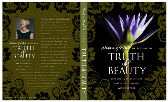
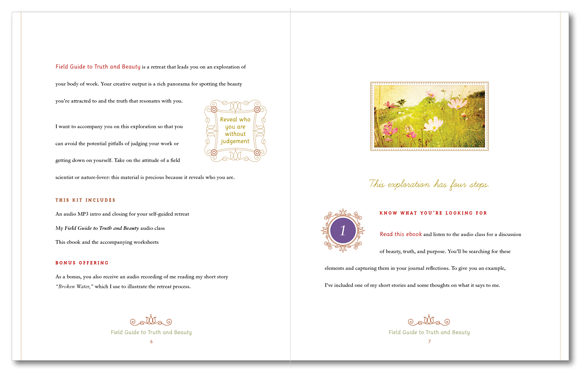
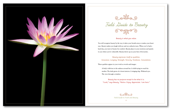
My first impression was that the design lived up to the product’s name: the layouts are jaw-droppingly beautiful. I knew that my clients would notice and appreciate this immensely. I also thought that the page layout was so evocative and amplified the text perfectly. You really captured the mood of my writing and added a polish and clarity to the words. I was reviewing the pages late at night and I was filled with such excitement and had a big grin on my face the whole time.
In what ways does the creative design process and ultimate result add value to your brand?
I serve writers and artists, people who know and value aesthetics, innovation, and attention to detail. The design for this book tells my clients that I understand what’s important to them, that I’m willing to go the extra distance for art, and they can too. The result is a premium product that gives my clients a lush experience.
When reviewing your new interior book design was there anything that revealed something new or different about your own content or story or purpose?
I loved seeing the segments that you highlighted and called out, which messages were most important. I could also see the underlying structure in the way you organized the document and distinguished different sections. I had a sense that the design revealed the richness in the plain words — it increased my sense of what the material was worth, from a price perspective but also in the effect on the reader.
When presenting your new book do you sense a shift in your own perceptions? A shift in the marketing of it or in the introducing of it to your audience? Do you anticipate the response you will receive, and how does that feel? Do you sense any other shifts that are worth noting?
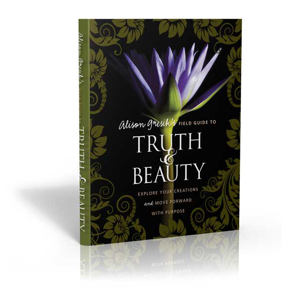
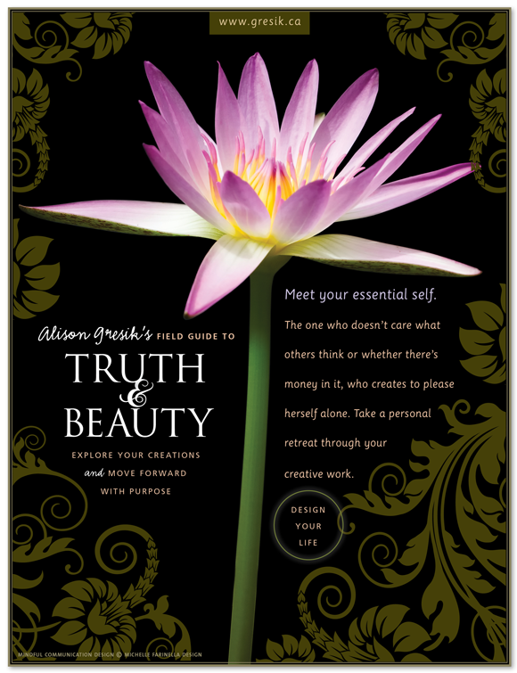
The high quality design made me proud and eager to get the book out there. There’s no doubt in my mind when I send it out that the response will be strongly positive, and indeed it has been. Having your posters, banners, and 3D image has shifted the emphasis in my promotion from text-based to more visual — I can showcase the images and let them speak for themselves which they do.
What do you feel is the most significant benefit of the design process, or the final result, that you think you appreciate and value the most? Which do you sense your readers appreciate and value the most?
I loved the way that our collaboration refined and reflected the content of the book — you were able to point out places that were incomplete, or affirm choices I’d made about what to include, because the design process showed you that. I also loved having a visual expert prepare the final product — having each of us contribute our strengths made the book that much more robust and timeless.
And I love how the design gives readers a visceral experience of the book’s message — that truth and beauty feed our creative appetite, and that making, creating, and enjoying art gives life meaning.
———————
Thank you, Alison. The Field Guide to Truth & Beauty is a beautiful contribution for artists and writers who want to go on a creative retreat to go deeper.
